Colors in the Home: Classic, Modern, or Minimalist Decor?

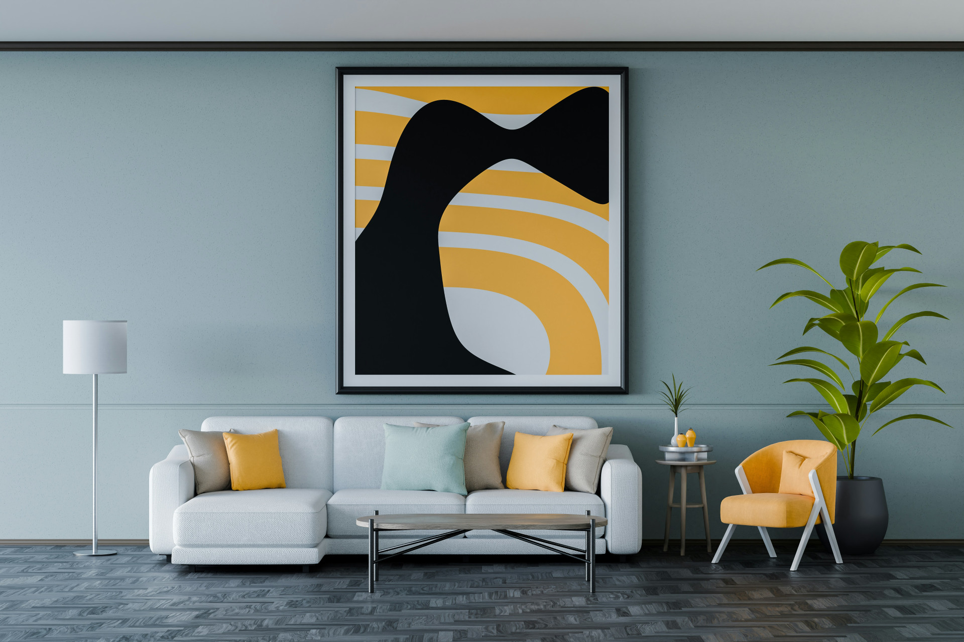
Colors in the Home: Classic, Modern, or Minimalist Decor?
Colors shape how we experience our homes. They influence light, space, and mood—and even how we feel when we walk through the door. But how do you choose the right palette? Should you lean toward timeless classics, bold modern tones, or the calm simplicity of minimalism? Here’s how to use color intentionally in your home, no matter your style.
Classic Decor – Warm Tones and Timeless Harmony
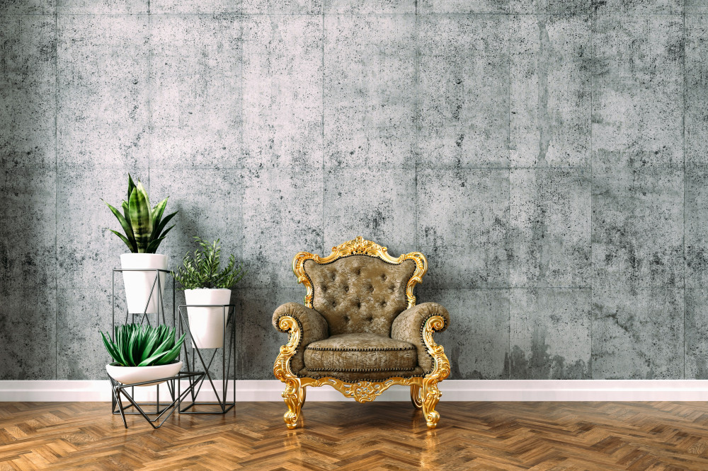
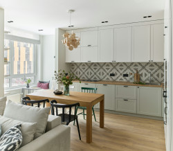
Classic interiors are all about balance, elegance, and a sense of continuity. Colors play a key role in creating that harmony. Think warm, muted shades like cream, beige, soft green, and navy blue. These tones bring depth and comfort without overwhelming the space.
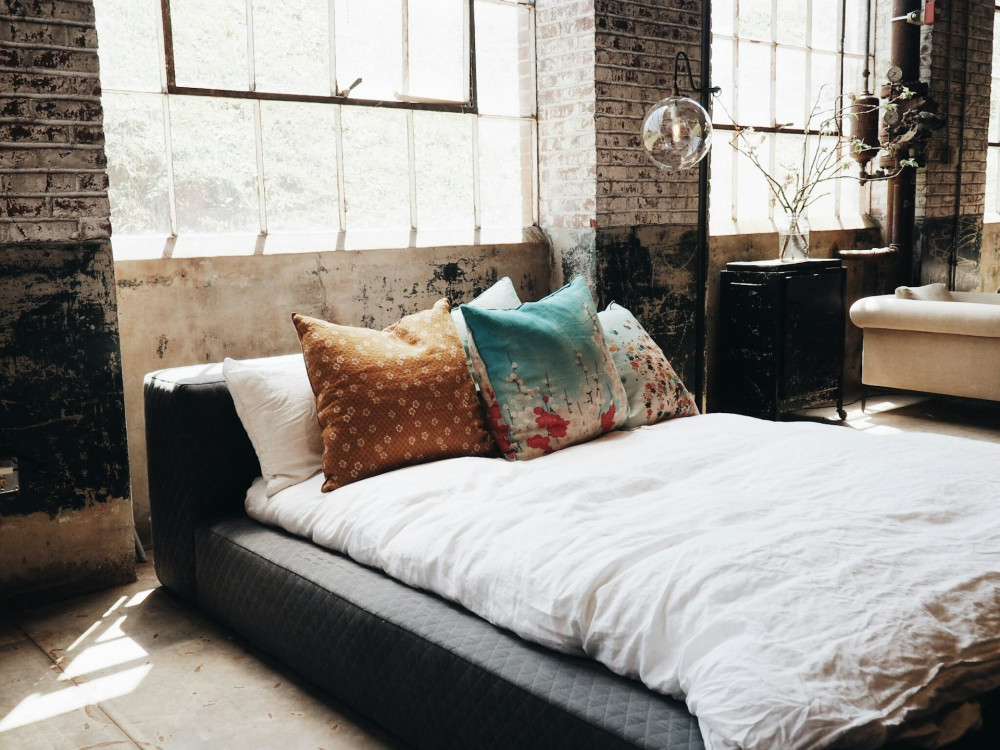
A classic home often pairs light walls with darker wood furniture or brass accents for warmth and contrast. Textures such as velvet, wool, and linen add richness and a welcoming feel.
A good approach is to start with a neutral base and layer in deeper hues through pillows, curtains, or artwork. This creates a look that feels enduring and can easily be refreshed with small updates over time.
Læs også:
Modern Decor – Bold Colors and Personality
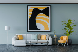
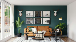
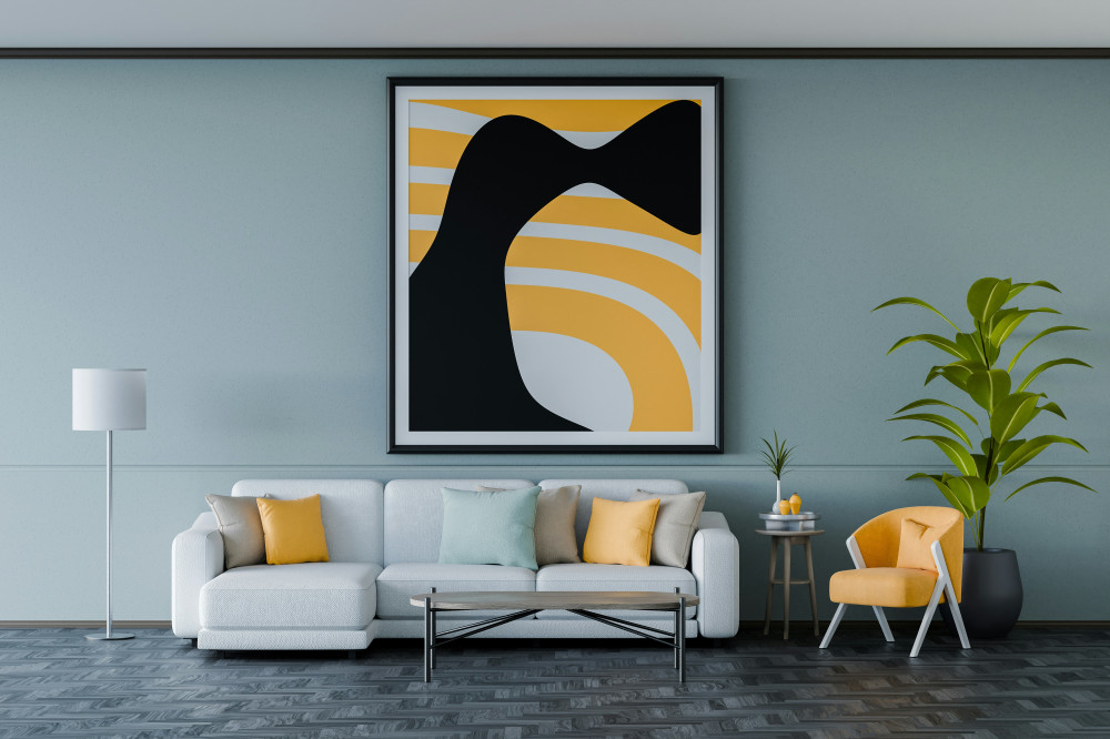
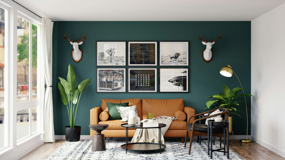
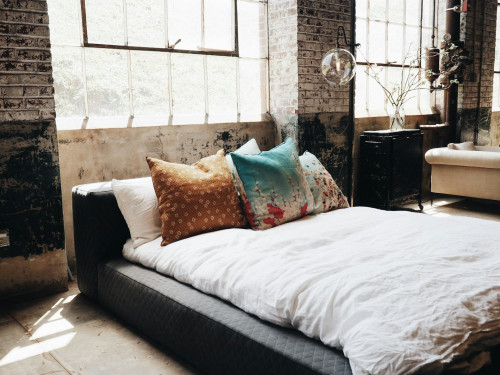
Modern design celebrates creativity and confidence. It’s about using color to make a statement—through contrast, unexpected combinations, and vibrant accents. Popular choices include mustard yellow, deep blue, terracotta, and forest green—colors that feel both expressive and grounded.
In modern spaces, color often defines the mood: a single painted wall, a brightly colored sofa, or a striking piece of art can transform a room. The key is to use color strategically, highlighting architectural features or personal style rather than filling every corner with intensity.
Try choosing one dominant color and letting the rest of the decor support it. This creates cohesion and ensures your color choices feel intentional rather than random.
Minimalist Decor – Light, Calm, and Simplicity
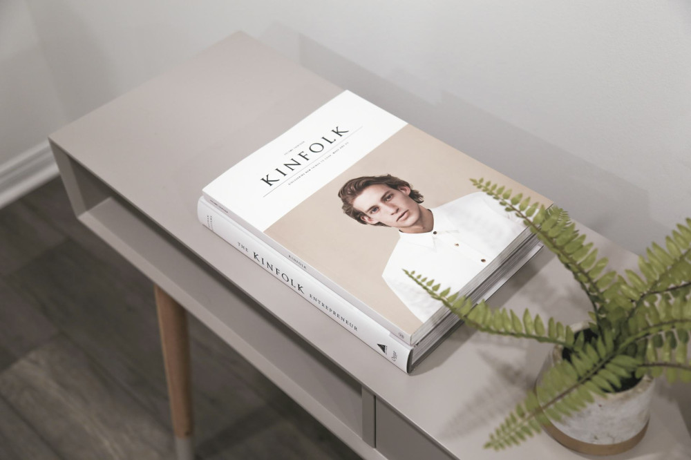
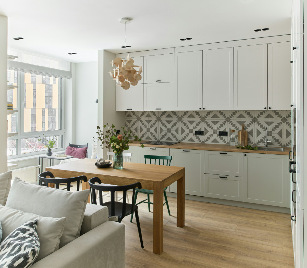
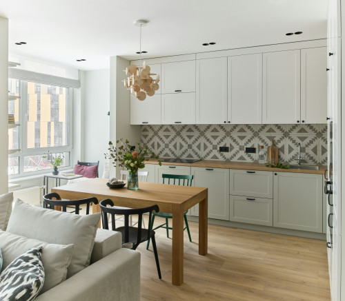
Minimalism is built on the idea that less is more. Here, colors are typically light, neutral, and understated—white, gray, sand, and pale wood tones dominate. The goal is to create a space that feels open, calm, and uncluttered.
While minimalist interiors may look simple, they require careful thought. To avoid a sterile feel, play with texture and subtle variations in tone. A warm gray wall, a natural fiber rug, or a few green plants can bring life and warmth without breaking the serene atmosphere.
Minimalism isn’t about avoiding color altogether—it’s about using it with purpose. A single colorful vase or piece of art can have a powerful impact when surrounded by neutrals.
Choosing Colors That Fit Your Life
Whether your taste leans classic, modern, or minimalist, the most important thing is that your colors reflect you and your lifestyle. Think about how you use each room and the mood you want to create.
- Living room: warm, inviting tones that encourage relaxation and conversation.
- Bedroom: cool, soothing shades that promote rest and balance.
- Kitchen: bright, fresh colors that energize and inspire creativity.
- Home office: neutral tones with a touch of color to boost focus and motivation.
Remember, lighting makes a big difference. A color can look completely different in natural daylight versus artificial light, so always test samples before committing.
Colors as a Reflection of You
Color in the home isn’t just about aesthetics—it’s about how you feel in your space. A well-chosen palette can make your home feel more harmonious, personal, and alive. Whether you prefer the warmth of classic design, the energy of modern style, or the calm of minimalism, the best choice is the one that makes you feel at home.
Colors are a language of emotion and expression. When you learn to use them thoughtfully, you can create a home that feels both beautiful and meaningful—every single day.
Læs også: